Top 5 Crypto Chart Patterns: Every Trader Should Know

Understanding crypto chart patterns is crucial for successful cryptocurrency trading. Among the 5 crypto chart patterns, the head and shoulders pattern and its inverse are key for identifying trading opportunities. These patterns indicate potential reversals in crypto trading, helping traders make informed trading decisions.
Continuing with continuation patterns, the bullish flag pattern and rectangle chart pattern provide insights into prevailing trends, while the triple top and double bottom pattern signify crucial support and resistance levels. Mastering these best crypto chart patterns enables traders to adapt their trading strategies to varying market conditions.
Additionally, interpreting chart patterns like the shoulders chart pattern and triangle chart patterns helps traders recognize lower highs and lower lows. By harnessing these key patterns, every trader can enhance their ability to trade crypto effectively and capitalize on promising trading opportunities.
Since crypto markets are always changing quickly, learning technical analysis and chart patterns becomes useful for traders. Measuring price and volume in the past allows traders to identify trading patterns that will show them which direction the market might go. Findings of similar patterns in charts or candles give you a better idea of when to buy or sell.
Identifying a consolidation or reversal may give you a signal that the existing trend will pause or reverse. Assets such as BTC, ETH, and others change rapidly, patterns make it possible to follow past trends instead of just guessing. Although these signals are not perfect, they help you create strategies that use chart patterns, instead of gut instincts.
1. Head and Shoulders
| Pattern | Signal | Entry | Target |
|---|---|---|---|
| Head and Shoulders | Bearish reversal | Break below neckline | Drop equal to head-to-neckline height |
| Inverse Head and Shoulders | Bullish reversal | Break above neckline | Rise equal to neckline-to-head depth |
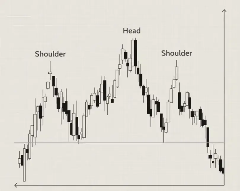
When this pattern appears, it means the market is likely to go from positive to negative. It consists of two smaller sides “shoulders” and a bigger middle “head” in the context of the head and shoulders chart. The horizontal or sloping line joins the lowest levels between the highest peaks. This shape depicts psychological behavior in markets: the first peak indicates the initial removal of profits, the second peak marks the bulls’ push to higher prices and the third peak shows the bulls’ resultant inability to reach the previous profit high. When the neckline is breached by sellers, it confirms that buyers are tired and a drop in prices is possible.
On the contrary, a trough where the head is lower than the shoulders indicates a bearish-to-bullish reversal, exemplifying the inverse head and shoulders pattern. Here the price reaches two peaks above a low middle trough before breaking up through the neckline of the head and shoulders chart. A good example is Bitcoin which built an inverse H&S from late 2019 to mid-2020, having a left shoulder in Dec 2019, a deep head at $3,782 in Mar 2020, and a right shoulder in mid-2020. BTC’s performance around late 2017 and early 2018 looked like a classic H&S, with shoulders at $17K–$18K, head at $20K and neckline at $11K. After BTC dropped below $11K in March 2018, the bearish reversal took effect and prices dropped.
Trading: Understanding trading patterns can significantly enhance your strategy in crypto trading. Traders wait for the neckline break and usually enter a trade in the direction of the break. In a standard head and shoulders, a short position is taken when the price closes below the neckline, with a stop just above the right shoulder. The drop from head to neckline suggests a target roughly equal in distance. In an inverse pattern, traders enter long when the price clears the neckline, using the drop from head to neckline to estimate the upside. Volume often confirms these patterns: a healthy head and shoulders will have lighter volume on the right shoulder and increasing volume on the break. Overall, the head & shoulders pattern (and its inverse) is considered one of the most reliable trend-reversal signals in technical analysis.
2. Double Top and Double Bottom
| Pattern | Signal | Shape | Example |
|---|---|---|---|
| Double Top | Bearish reversal | M-shape | BTC peaked twice near $64K in 2021 |
| Double Bottom | Bullish reversal | W-shape | MATIC bottomed twice before rising |
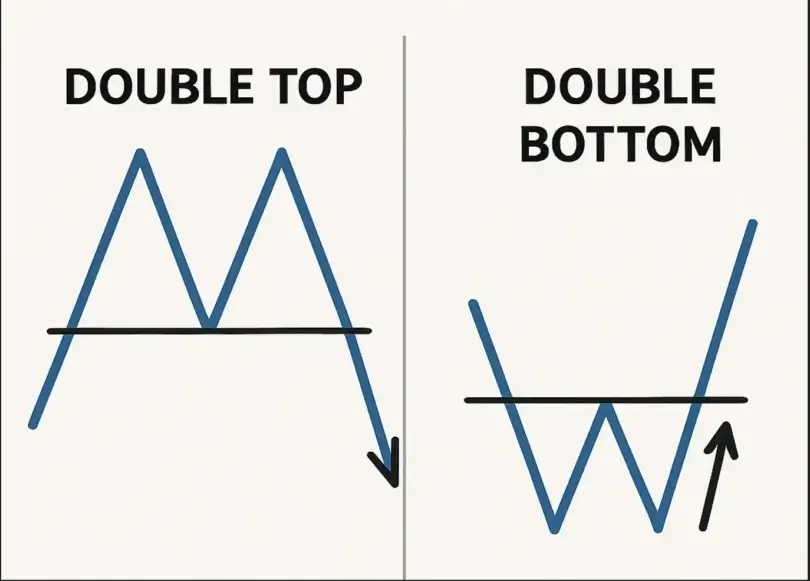
A double top is a bearish reversal pattern that looks like an “M” on the chart, while a double bottom (a “W” shape) is a bullish reversal pattern. In a double top, price peaks at a resistance level twice and fails to break higher, signaling sellers are strong. In a double bottom, price falls to support twice and holds, indicating buyers step in. For example, Bitcoin in April–June 2021 formed a double top: the first peak around $64,800, a pullback to ~$47,000, then a second peak near $64,000. When BTC finally broke below ~$47K, that breakdown confirmed the inverse head and shoulders pattern and a bearish trend continuation was set.
For a double top, traders put in a sell/short order when price falls below the middle point or “neckline,” between the peaks. The second peak tends to have low volume until the breakdown which triggers higher volume. When the price exceeds the middle high of a double bottom, then you can place a buy order to open a long position. According to AltFINS, traders normally buy when the neckline is crossed and expect the price to rise by a level equivalent to the pattern’s height. Many traders put the stop-loss point just below the lowest point of the chart formation.
Double tops/bottoms have actually appeared in BTC, ETH, SOL and MATIC: for example, an ETH double top and a MATIC double bottom showed the markets’ response. Watching the volume that appears during the breakout allows you to ignore decoy signals and protect your money.
3. Ascending and Descending Triangles
| Pattern | Trend | Breakout Direction | Volume Confirmation |
|---|---|---|---|
| Ascending Triangle | Bullish continuation | Above flat resistance | Rising volume on breakout |
| Descending Triangle | Bearish continuation | Below flat support | Rising volume on breakdown |
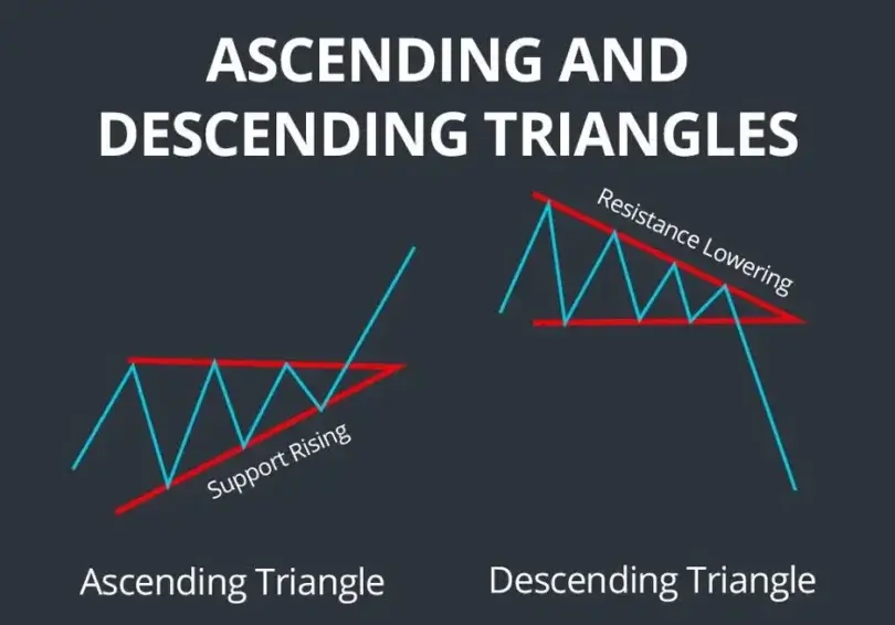
An ascending triangle and a descending triangle are continuation formations; they may reverse the trend at the end. This kind of triangle makes an uptrend—the price touches new highs and stays below the line of resistance. People are jumping into the market which raises the price as time passes. When there is a big spike in trading volume, the breakout is commonly upwards. But if a descending triangle forms during a downtrend, the highs get lower over the support line, meaning sellers are stronger than buyers.
For example, Ethereum (ETH) was making movements that resembled an ascending triangle, approaching the $2,800 flat resistance, with its prices rising at each dip. A clear price break over the flat top is watched by traders to show the trend is going to continue and to aim for the height above the flat line. Solana (SOL) formed an ascending triangle that you could see in late 2023 when the price stayed around $100 and moved up slightly from the previous lows.
Trading: Traders in an ascending triangle tend to acquire positions when the price rises above the horizontal line with higher trading volume, a common crypto pattern Traders in an ascending triangle tend to acquire positions when the price rises above the horizontal line with higher trading volume, a common crypto pattern. The sum of the triangle’s height and the breakout price gives a forecast for the price.
The indicator drops more than its recent low level. Once support is broken in a descending triangle, traders aim to sell and their target is at the height of the triangle. You should wait for confirmation, usually from a candle closing above or below the line, and watch for the volume to expand. Such chart patterns are often seen in cryptocurrencies and mixing them with indicators may enhance their reliability.
4. Flag and Pennant Patterns
| Pattern | Trend Direction | Shape | Target |
|---|---|---|---|
| Bull Flag | Uptrend | Parallel channel down | Flagpole height added |
| Bear Flag | Downtrend | Parallel channel up | Flagpole height subtracted |
| Pennant | Trend continuation | Symmetrical triangle | Breakout in prior trend direction |
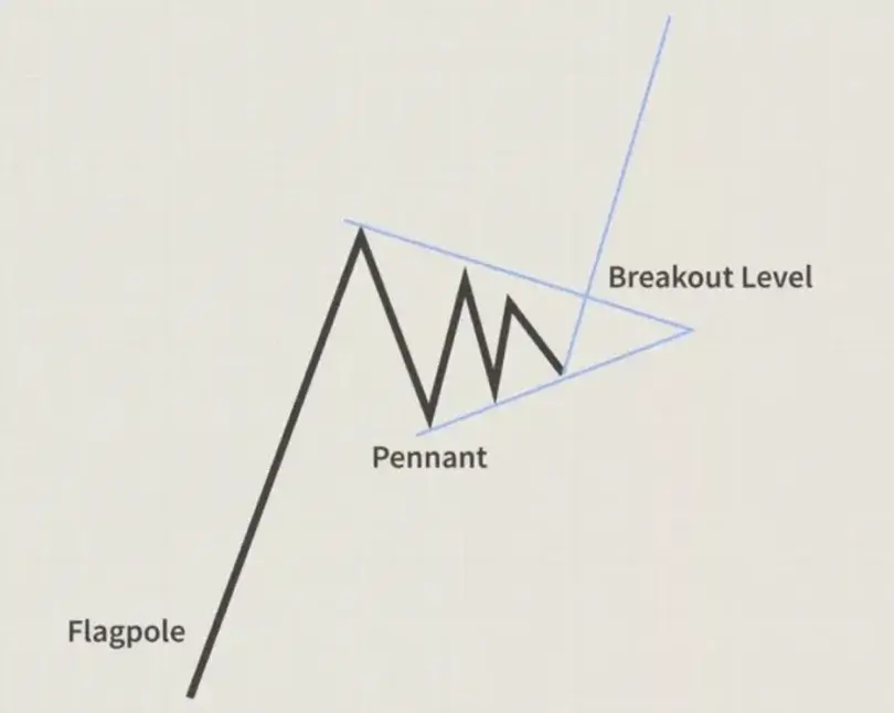
Flags and pennants happen when the price continues in the same direction after a strong price movement. After the rally, the price in a bull flag narrows within a horizontal or slightly falling channel (the flag). This pause usually leads to another climb in stock prices. A bear flag happens when there is a quick fall, then a small slanting channel higher and finally, a downfall. A pennant is shaped like a small symmetrical triangle (with the same sides converging) which appears after a big move. The pattern calls for the previous trend to renew after the volume in the pennant/flag.
It shows that during a short time, people sell or buy to satisfy profit-taking, but soon, the trend from earlier returns. As an example, traders use bullish flags when Bitcoin moves up fast toward $30K and then stabilizes in a $400 area before rising even higher. A noteworthy instance is when BTC jumped up to ~$30,000, decreased a bit, and then traded with no clear movement between ~$29.6 and $30K; the belief was that it would rise past $30,000, forming a bullish continuation pattern. Most of the time, volume is important in crypto trading: flags are marked by high volume and as the flag or pennant ends, volume falls off, then surges at the breakout.
Trading: Market participants usually join the flags and pennants in the direction the trend is going. After the bullish flag or pennant forms, a buy order is entered just above the high in the flag/pennant and the expected movement is equal to the flagpole’s length. Many traders often put their stop-loss at the lowest point found during the consolidation period. In the same way, a broken bearish flag or pennant encourages taking short positions.
As an example, you could purchase nearly $30K and put your stop loss at $29.6K with BTC. Confirming a breakout with an increase in volume provides better chances of success. Flags and pennants can appear at any timeframe and they’re favorite for crypto traders due to the common quick fluctuations and short periods of stasis in the crypto market.
5. Cup and Handle
| Pattern | Phase | Signal | Target |
|---|---|---|---|
| Cup and Handle | Consolidation & breakout | Above handle resistance | Cup height added to breakout point |
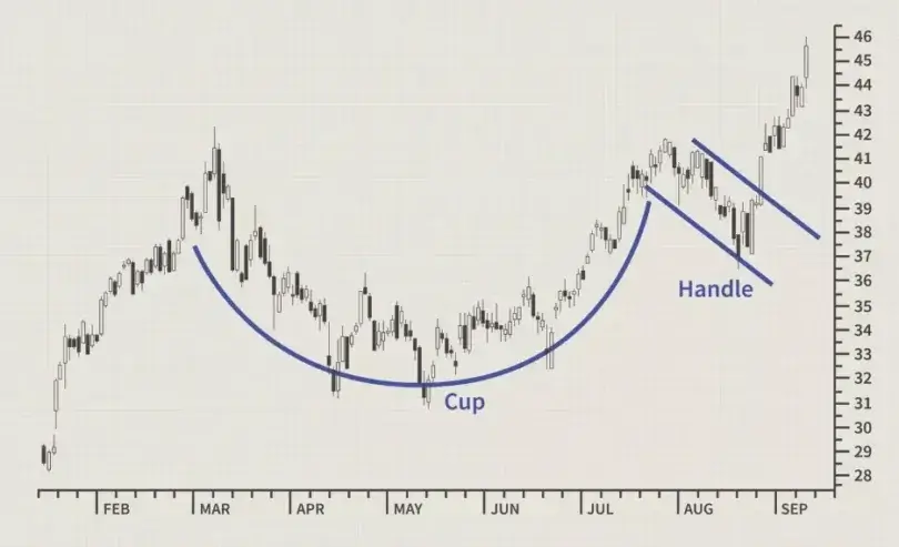
The cup and handle pattern is a bullish way for prices to continue or reverse and it has the shape of a teacup. This happens when pthe rice creates a “cup” pattern in the lower part of the chart and then repeats lower just before it starts to go higher. The shape of the cup shows that spending has fallen as saving has increased with time. There is a short convex area on the right side of the candle, called the handle. When traders rush to open a position at the highest pitch, they often end up selling earlier in the following handle of the trading pattern which lets the market break out even further later. The handle usually gets narrower and the breakout larger.
These patterns can appear on high timeframes and may require a number of weeks or months to emerge in crypto. This is demonstrated in Bitcoin which saw a rise out of a cup pattern; the dip before that was the handle and the following price rise was the cup, illustrating one of the 10 crypto chart patterns every trader needs to know. Changelly explains that the cup and handle on a chart are noticeable because the price goes up, dips at some point, and then comes back to the level it was at before. If the price follows this pattern, overcoming the resistance at the handle’s top is usually a sign of a major advance.
Trading: Breaking the handle’s resistance suggests to traders that a bullish move may take place. A typical approach is to buy once the price ends above the top of the handle and to put a stop loss below its bottom. The usual way to calculate the price target is to add the cup’s top to the breakout volume. These indicators (such as an RSI breakout and more volume) confirm that the trade is a good idea. Just like other patterns, cups, and handles cannot be relied on; even so, when a clear U-shaped part and a handle show up on a significant crypto chart, traders can treat it as an opportunity for a breakout.
FAQ
Do chart patterns work in crypto?
Yes, chart patterns can be effective in crypto trading. They help traders identify trends, potential reversals, and entry/exit points—especially in highly volatile markets.
What is the best crypto chart?
Candlestick charts are the most popular and useful for crypto traders. They provide detailed price action insights and help visualize patterns more clearly than line or bar charts.
What is the most successful chart pattern?
The head and shoulders pattern (and its inverse) is considered one of the most reliable for predicting trend reversals in both traditional and crypto markets.
Which chart is most effective?
The effectiveness depends on your strategy, but candlestick charts combined with volume indicators are widely considered the most effective for short- and long-term crypto analysis.


